Introduction
I was for their first four years the head of design at Tyba, a startup that wanted to improve recruitment and offer companies, recruiters and candidates an environment where finding the best talent and the best jobs were made in a more simple, friendly and fast way.
Tyba
https://www.tyba.com
UI/UX, Code
2011-2015
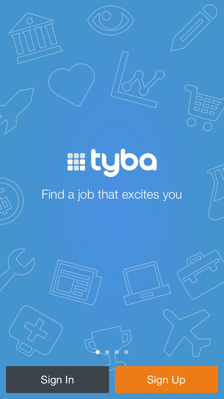
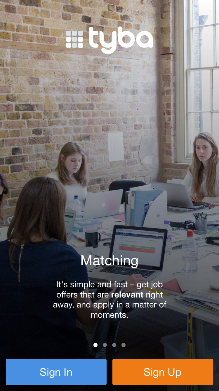
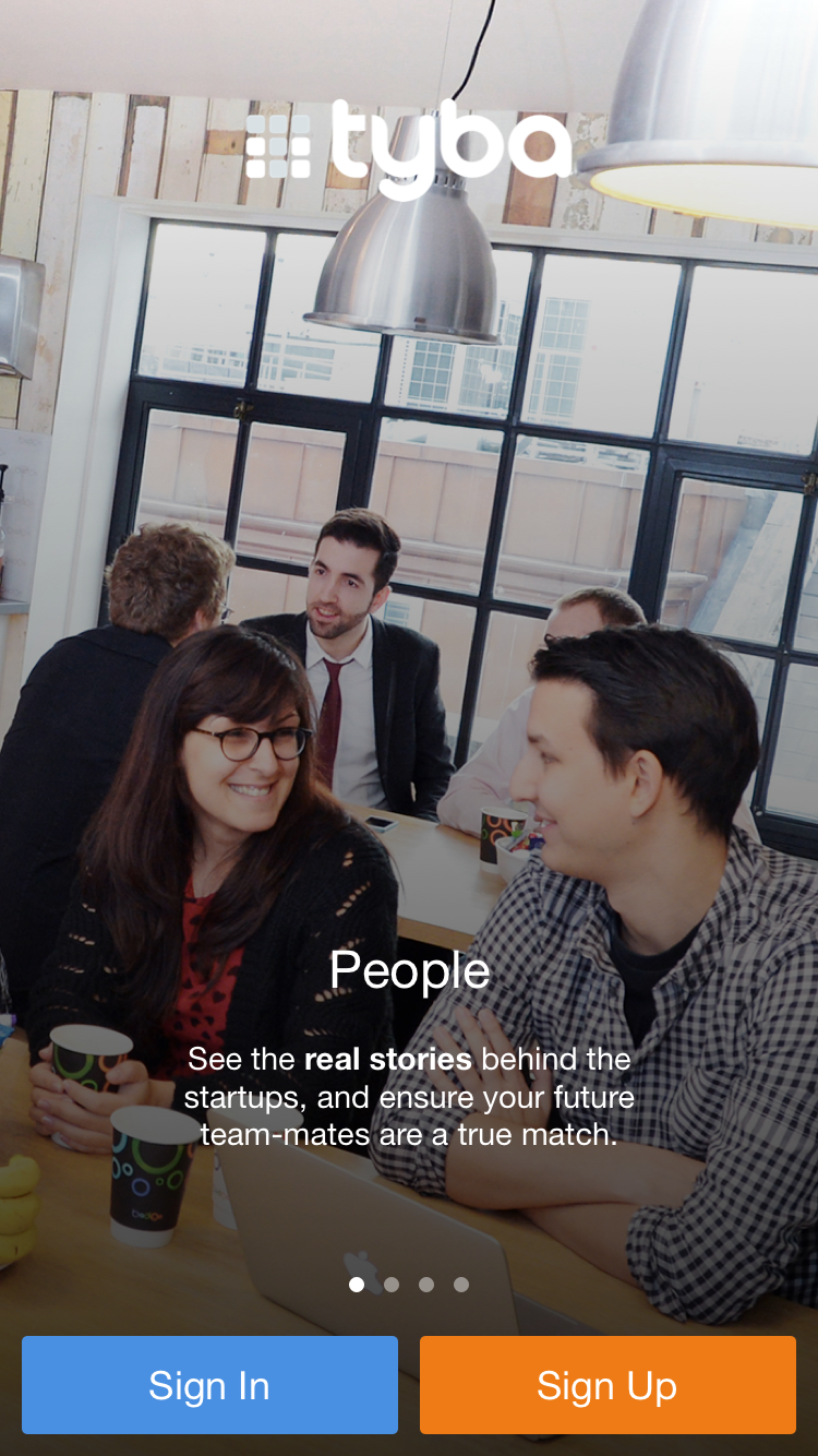
01 Tyba iOS App
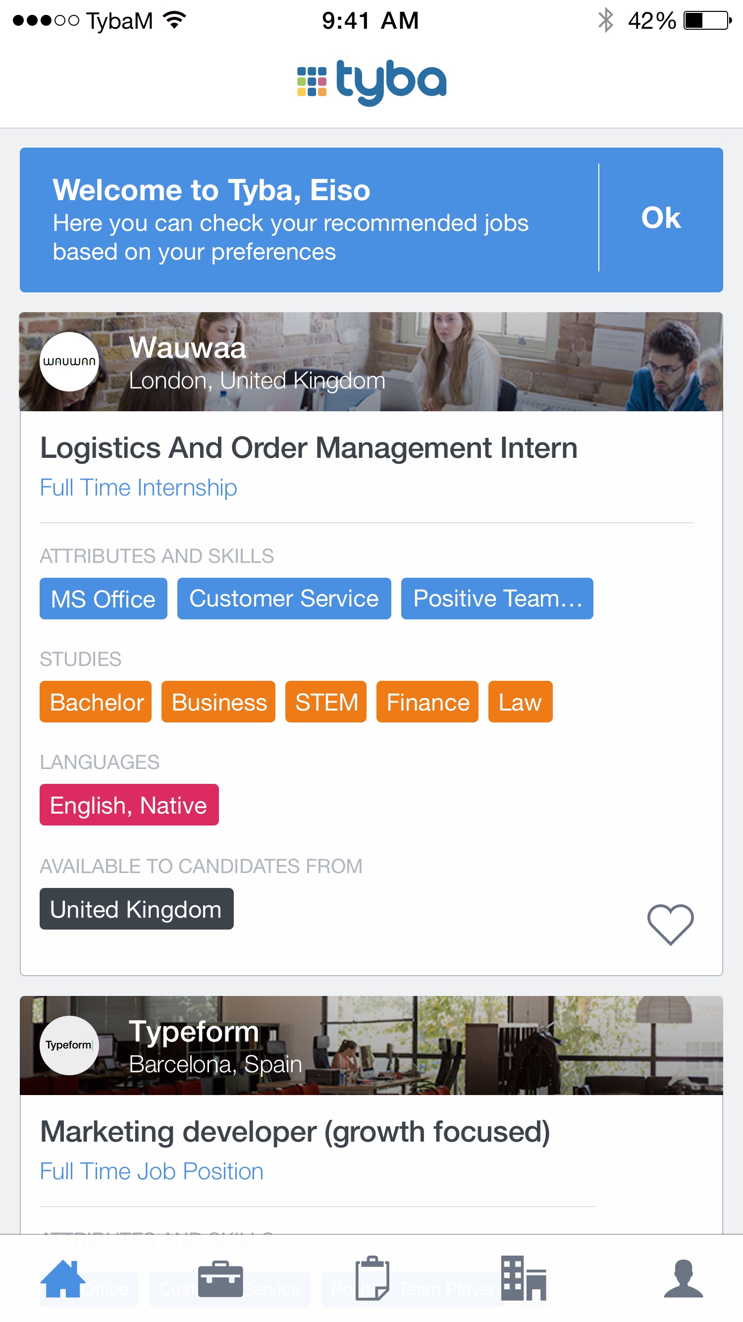
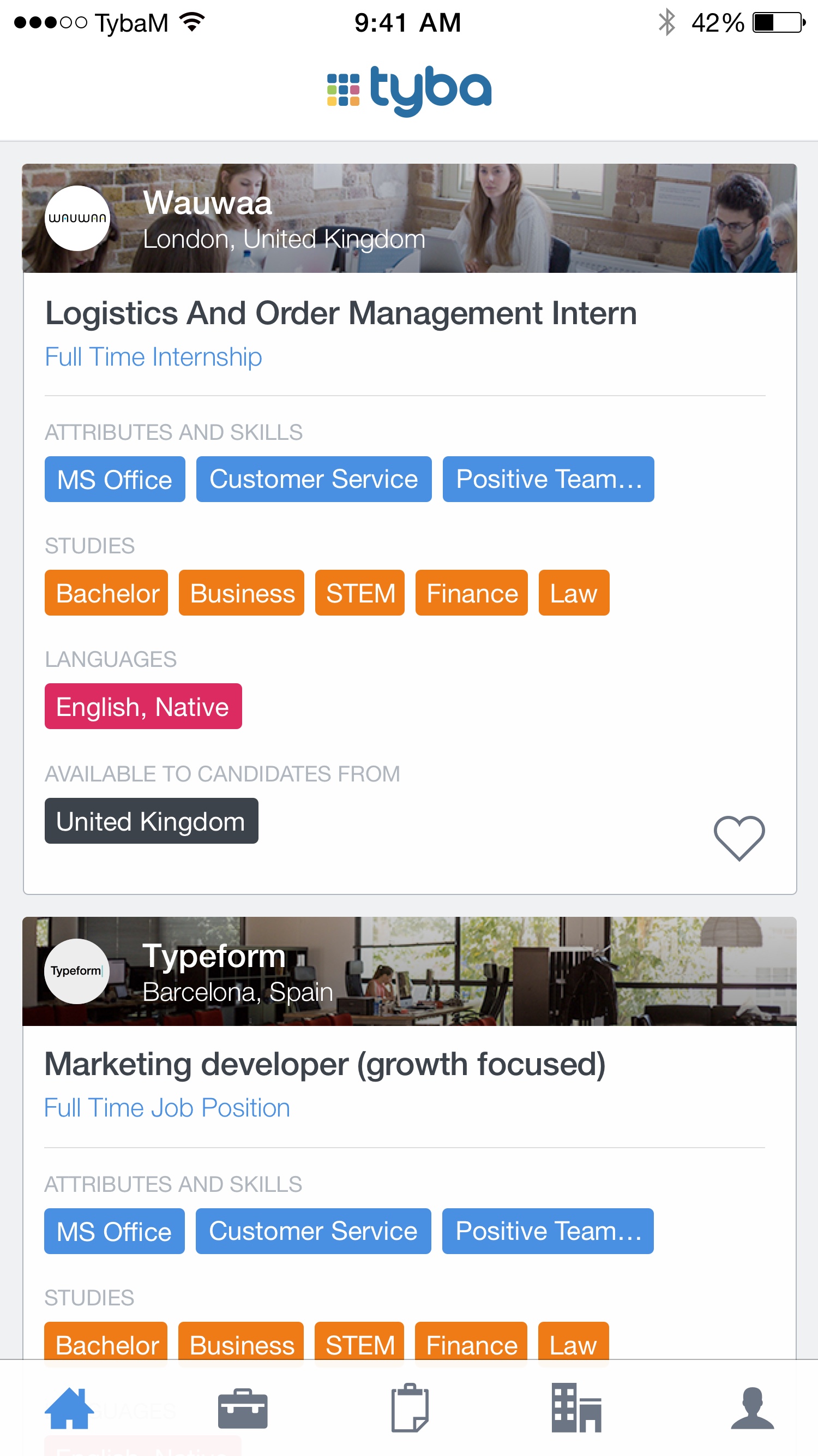
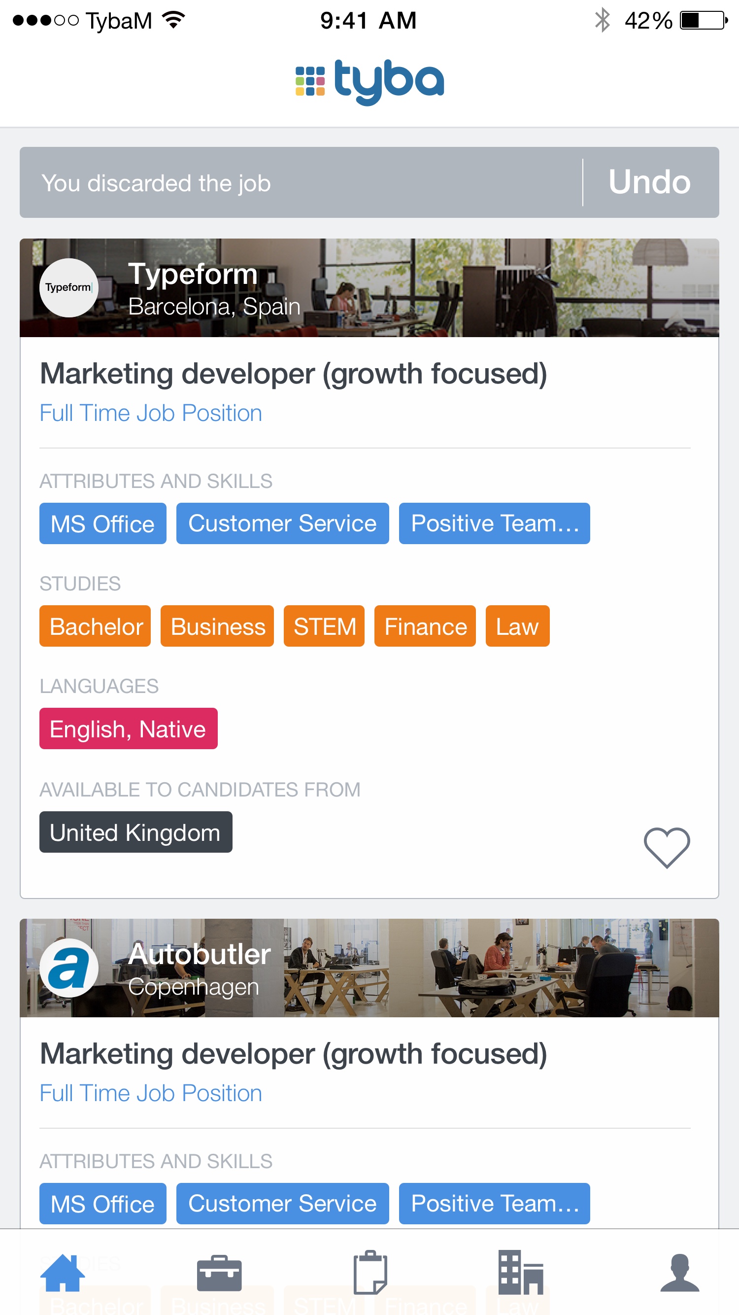
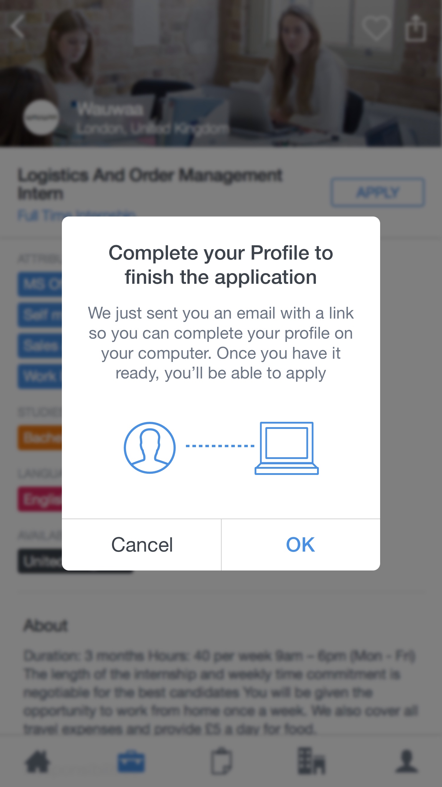
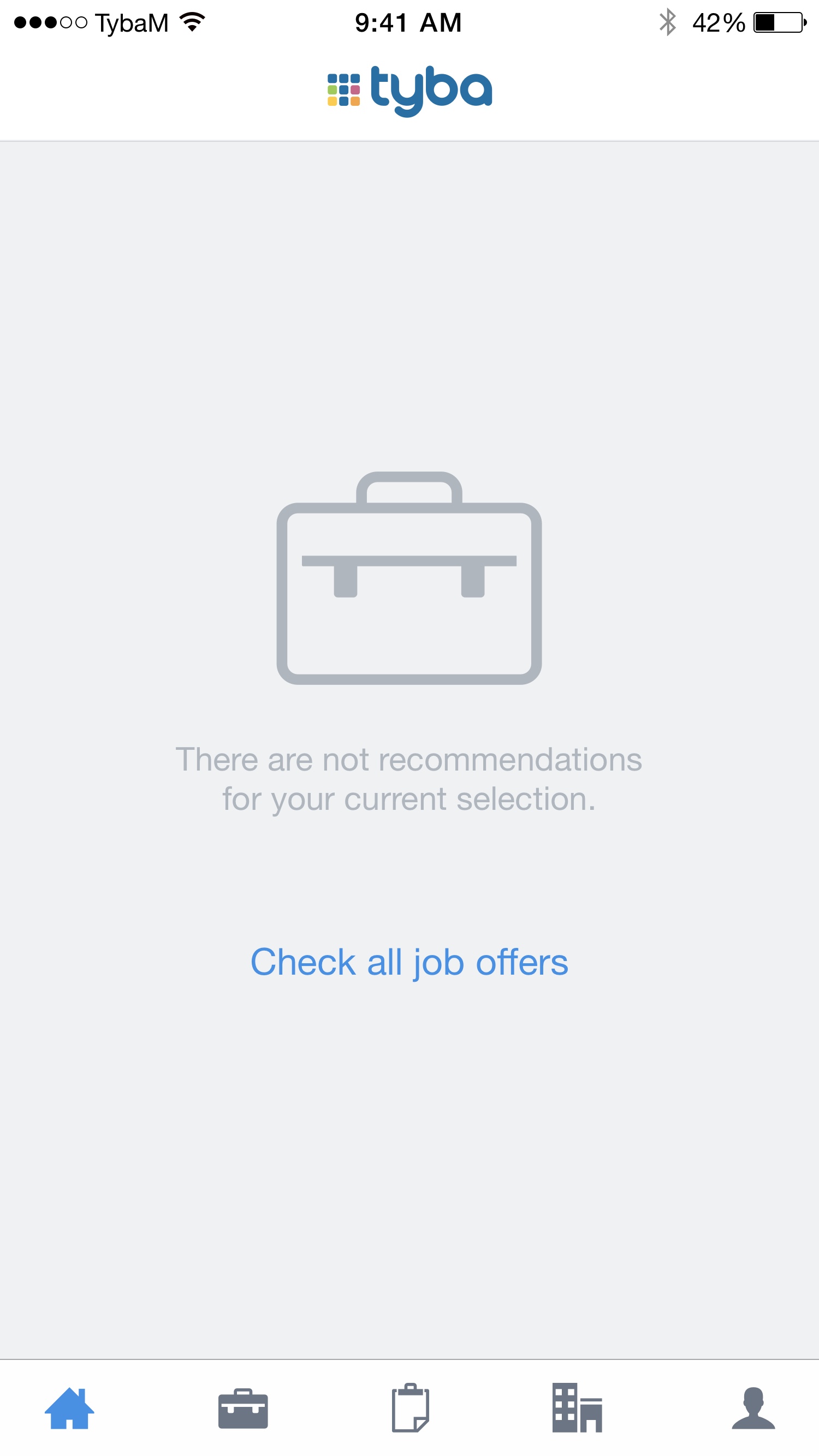
To offer the candidates a new experience of finding a job, we scratched a new mobile app where the main focus would be the visual content to make more attractive the companies, but also a simpler way to find jobs and decide if it was or not ok, using the Tinder swipe approach.
Tyba
https://www.tyba.com
UI/UX, Mobile, Prototyping
2014
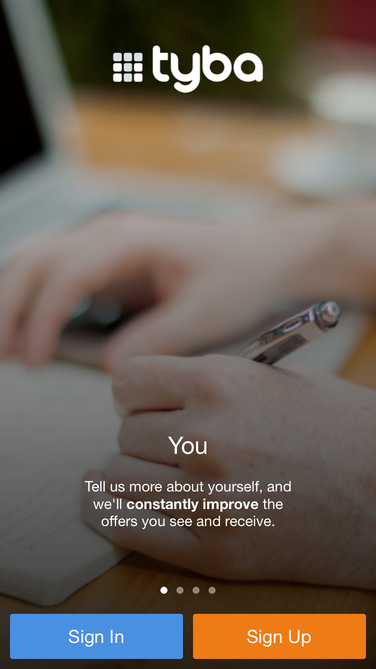
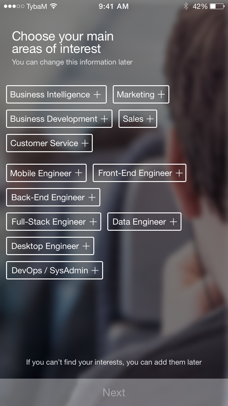
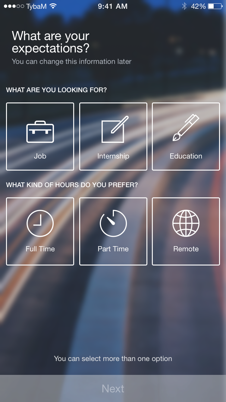
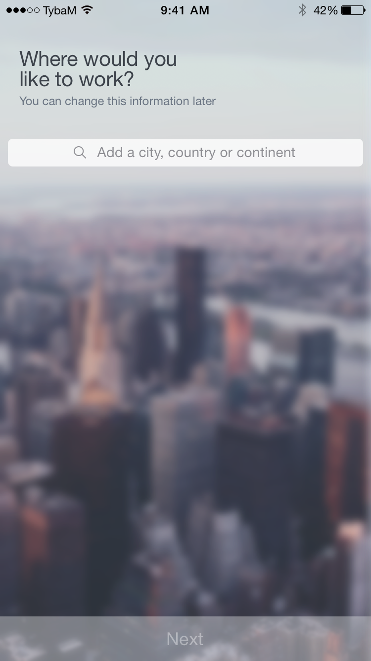
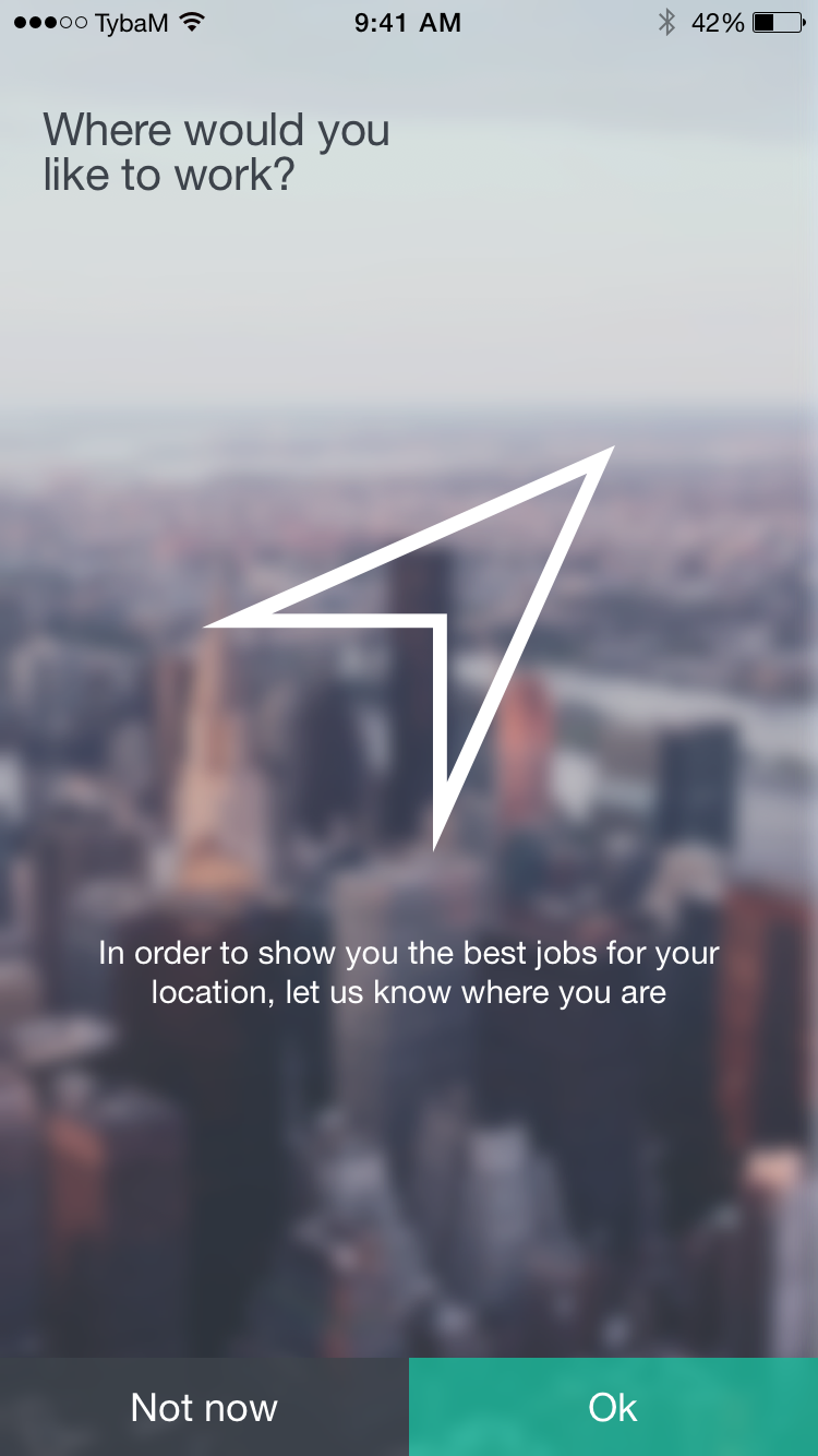
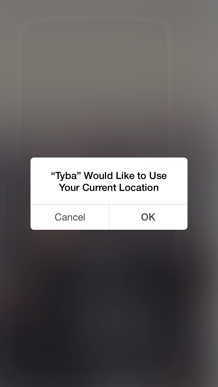
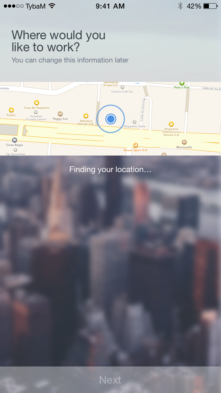
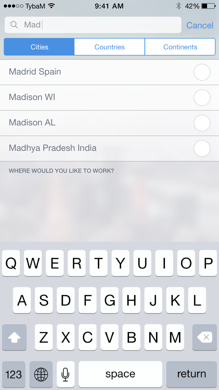
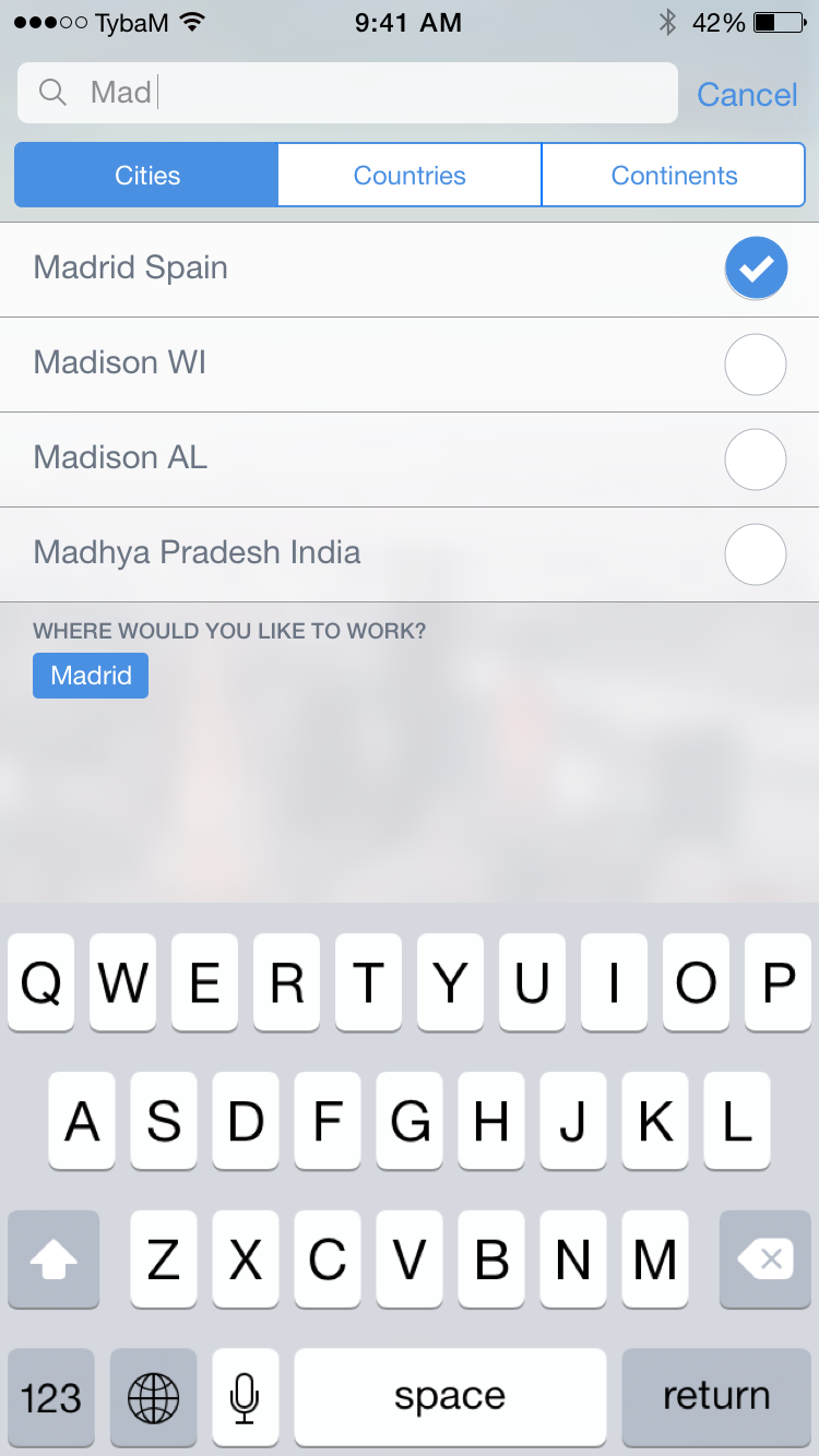
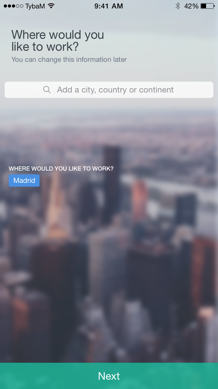
Onboarding
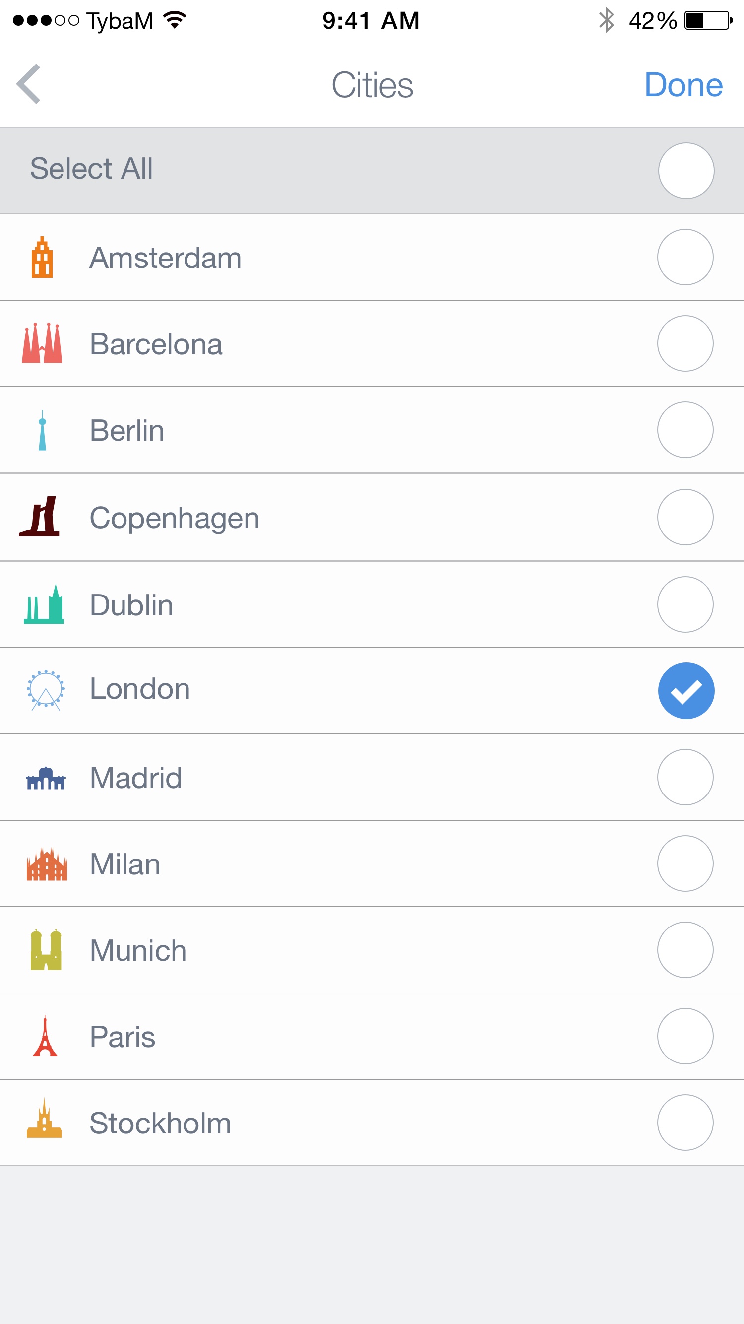
The first time a user opens the app, it goes through a simple onboarding to ask their interests and availability so we can offer the most interesting offers and companies customized for each candidate.


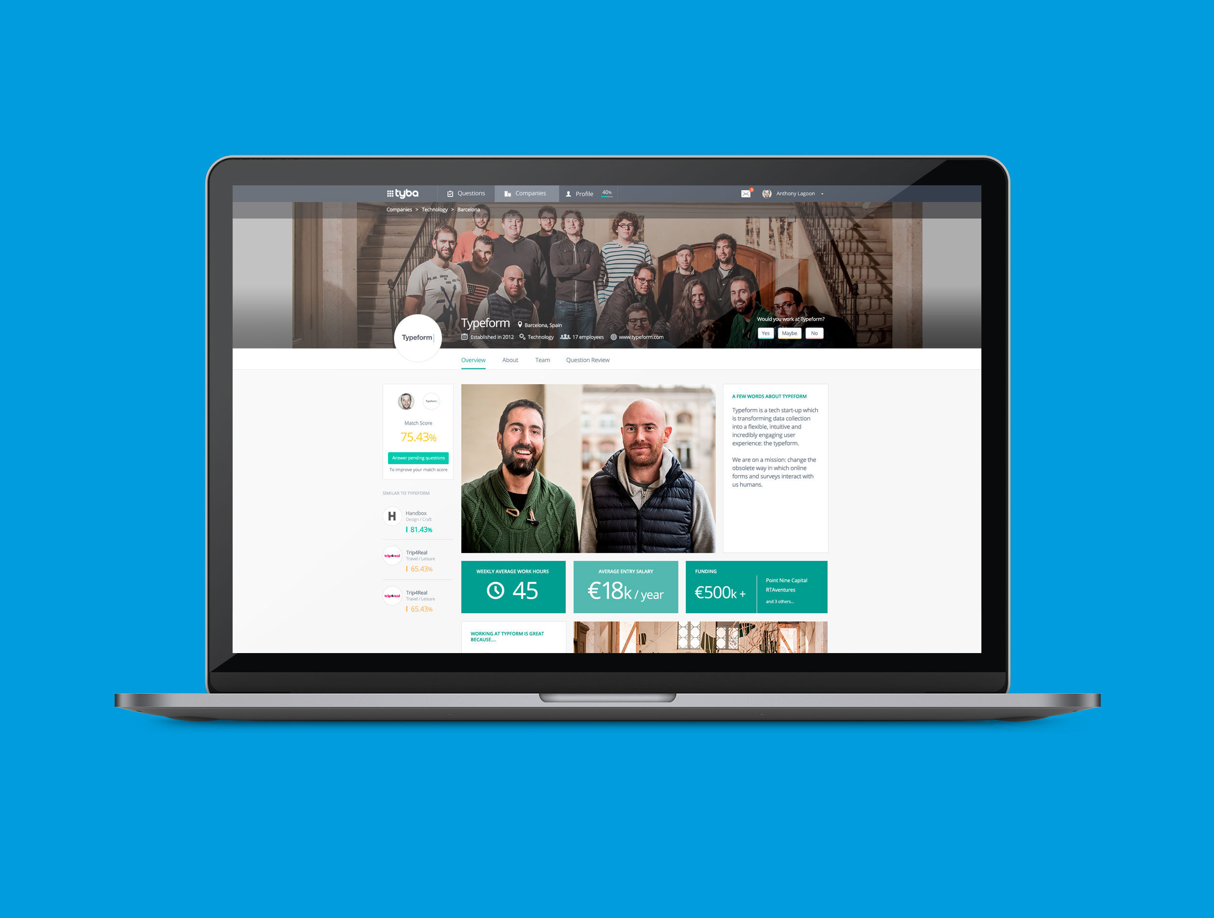
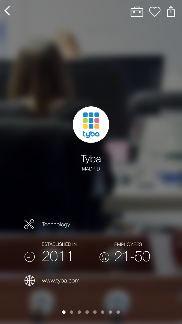
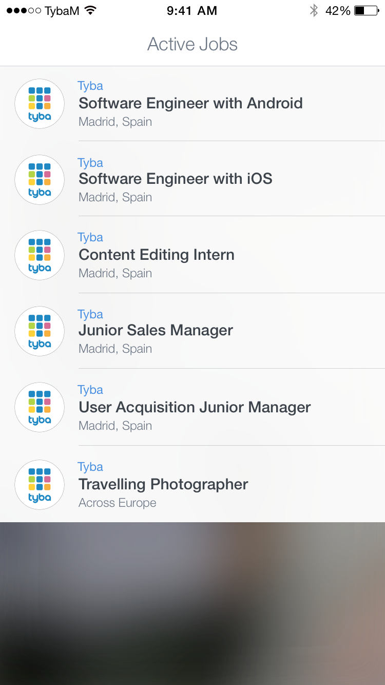
Company pages
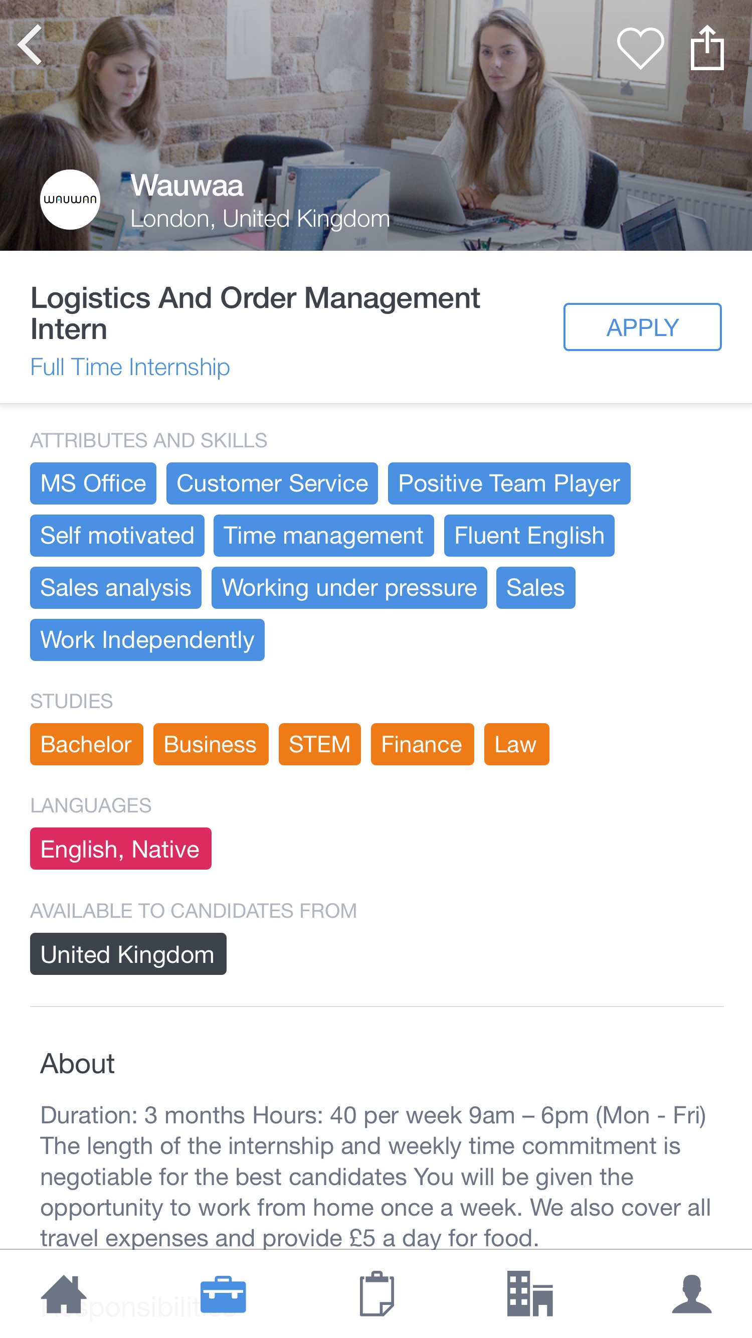
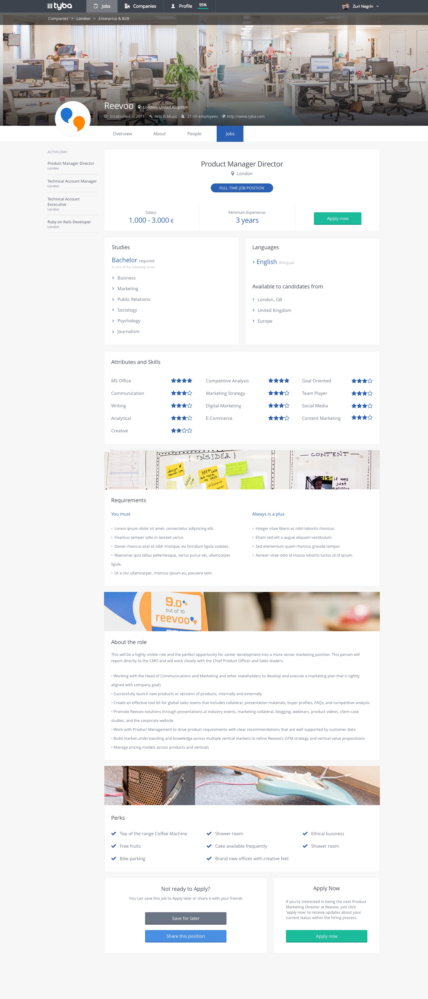
To make the company pages more attractive for the candidates, I created a new full screen experience with animated details, where the content was the most important. It featured images, videos and texts, apart from direct access to the job offers or marking companies as favourite to save them for later.

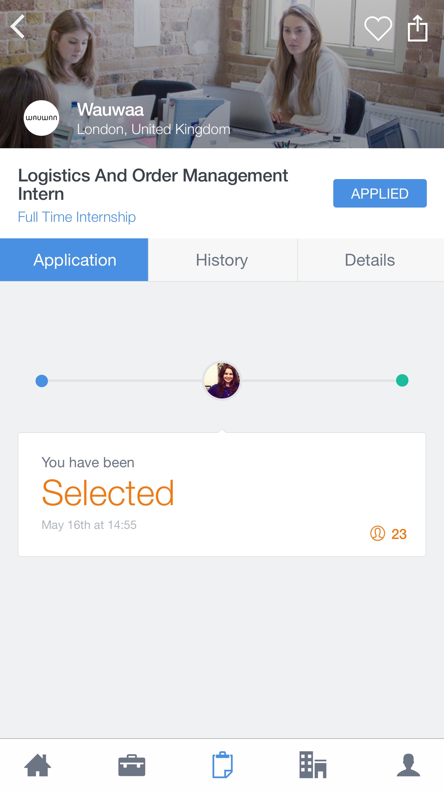
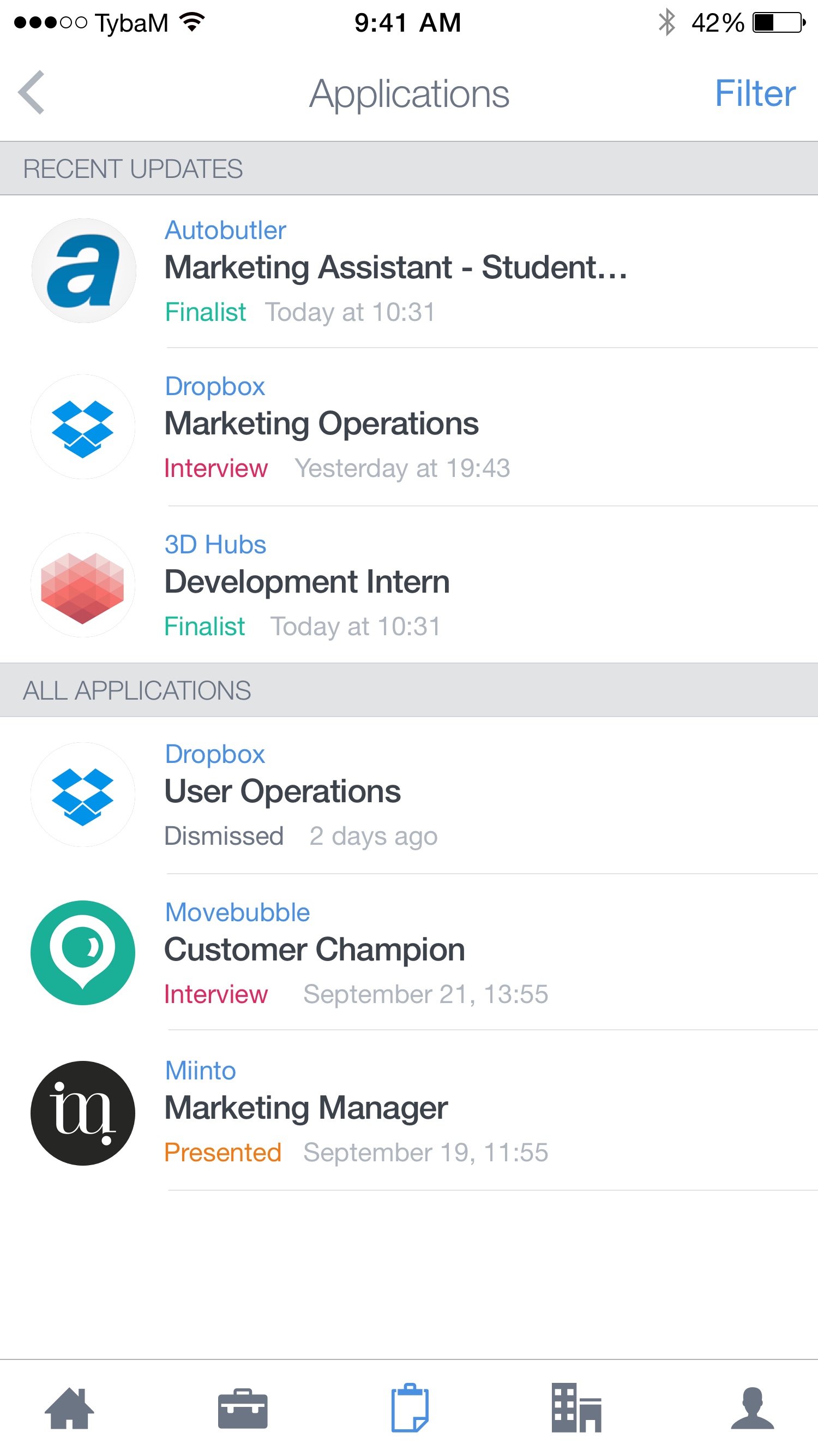
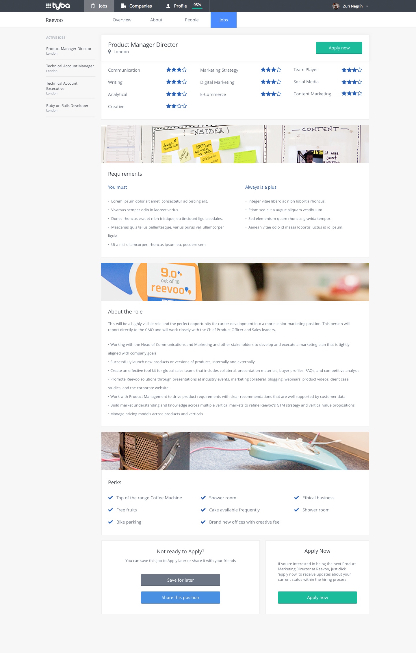
Jobs, offers and other screens
The flow of the app included job posts in a simple and compact view to make it easier to navigate through them.


02 Recruiter Tools
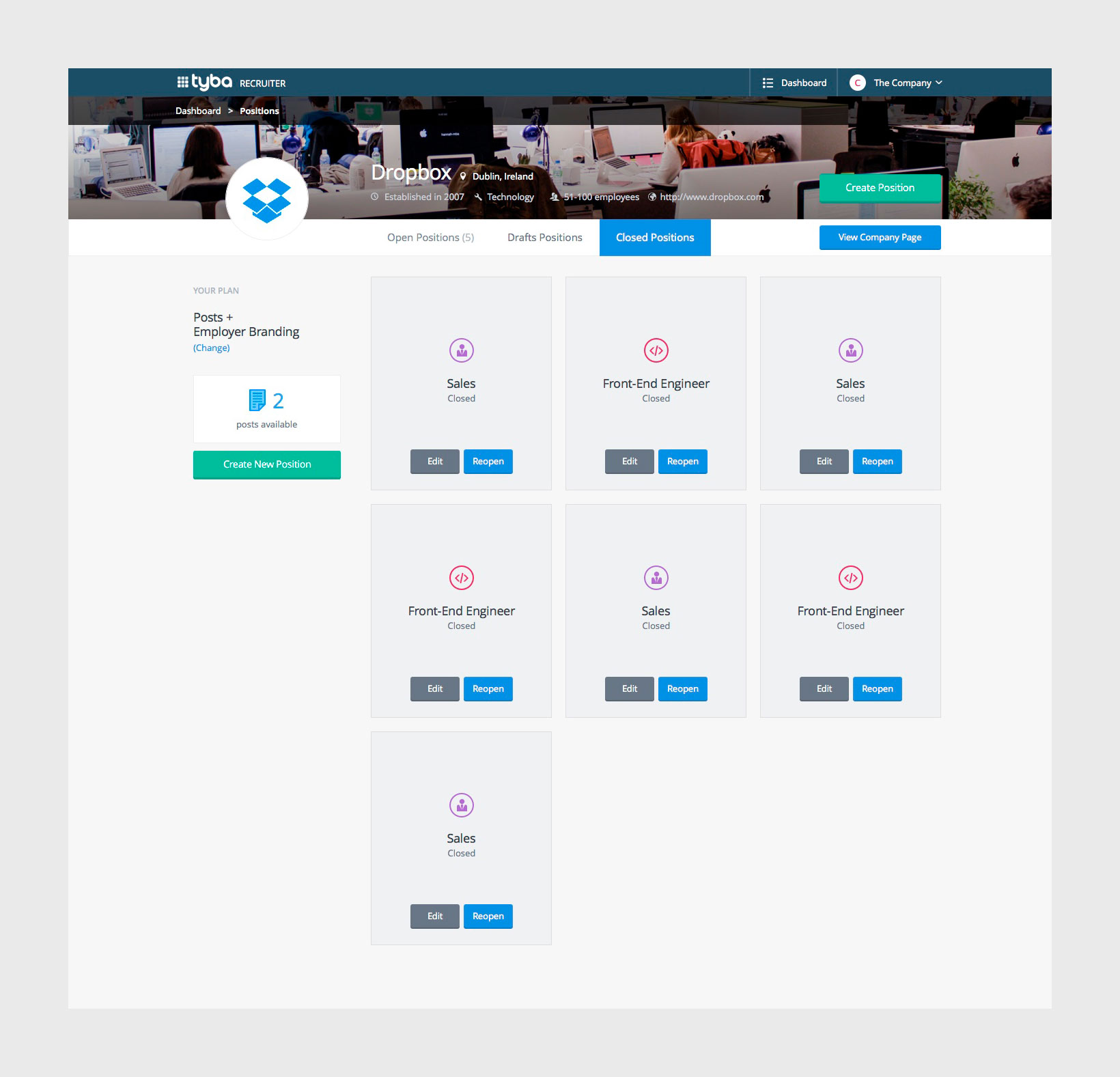
The companies registered with Tyba had the option to manage and create job posts, check the candidates, open and close positions and a lot of different options to review and manage their openings.
Tyba
https://www.tyba.com
UI/UX, Code
2014-2015
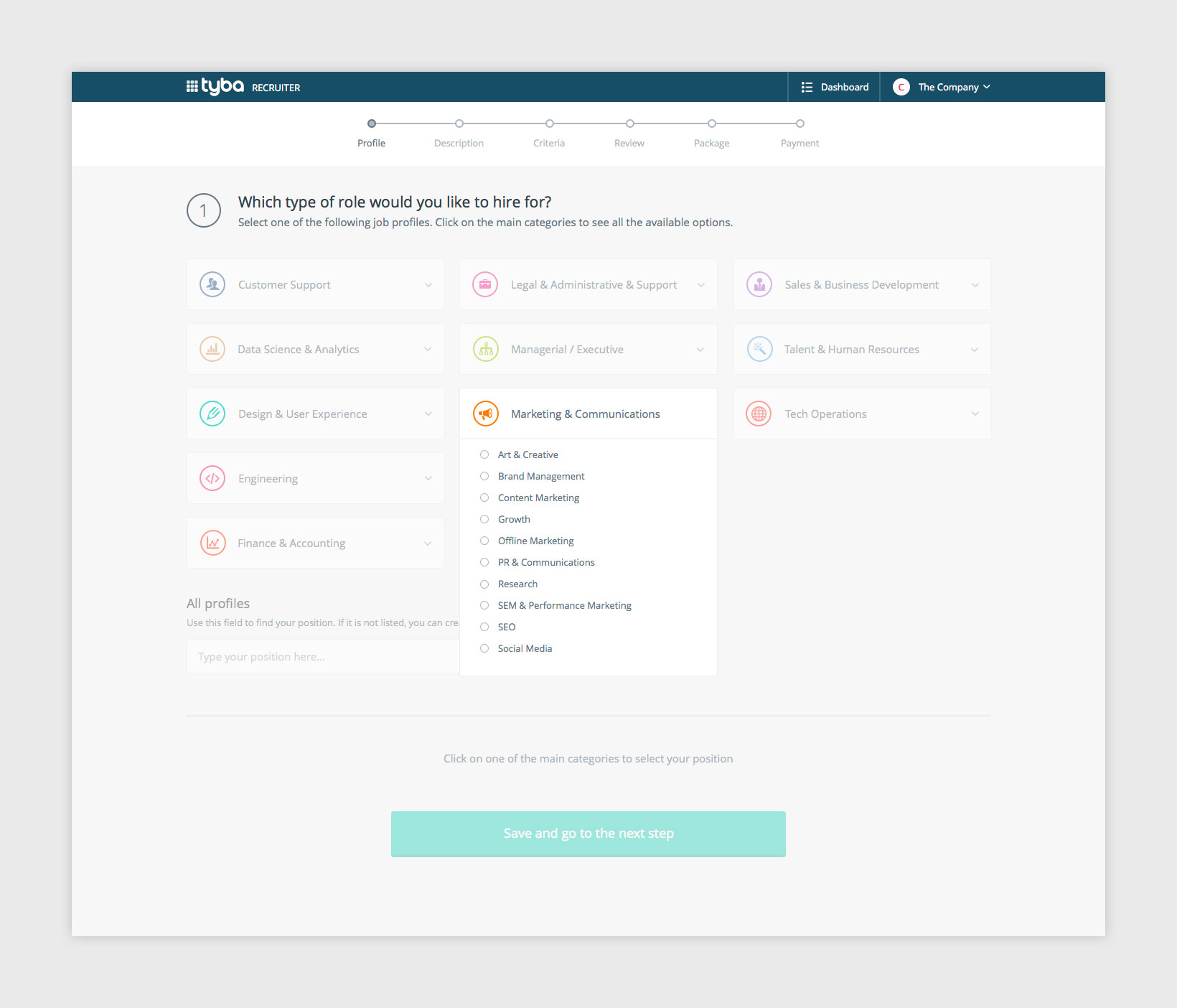
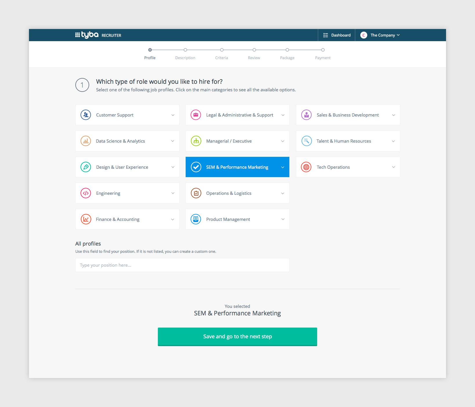
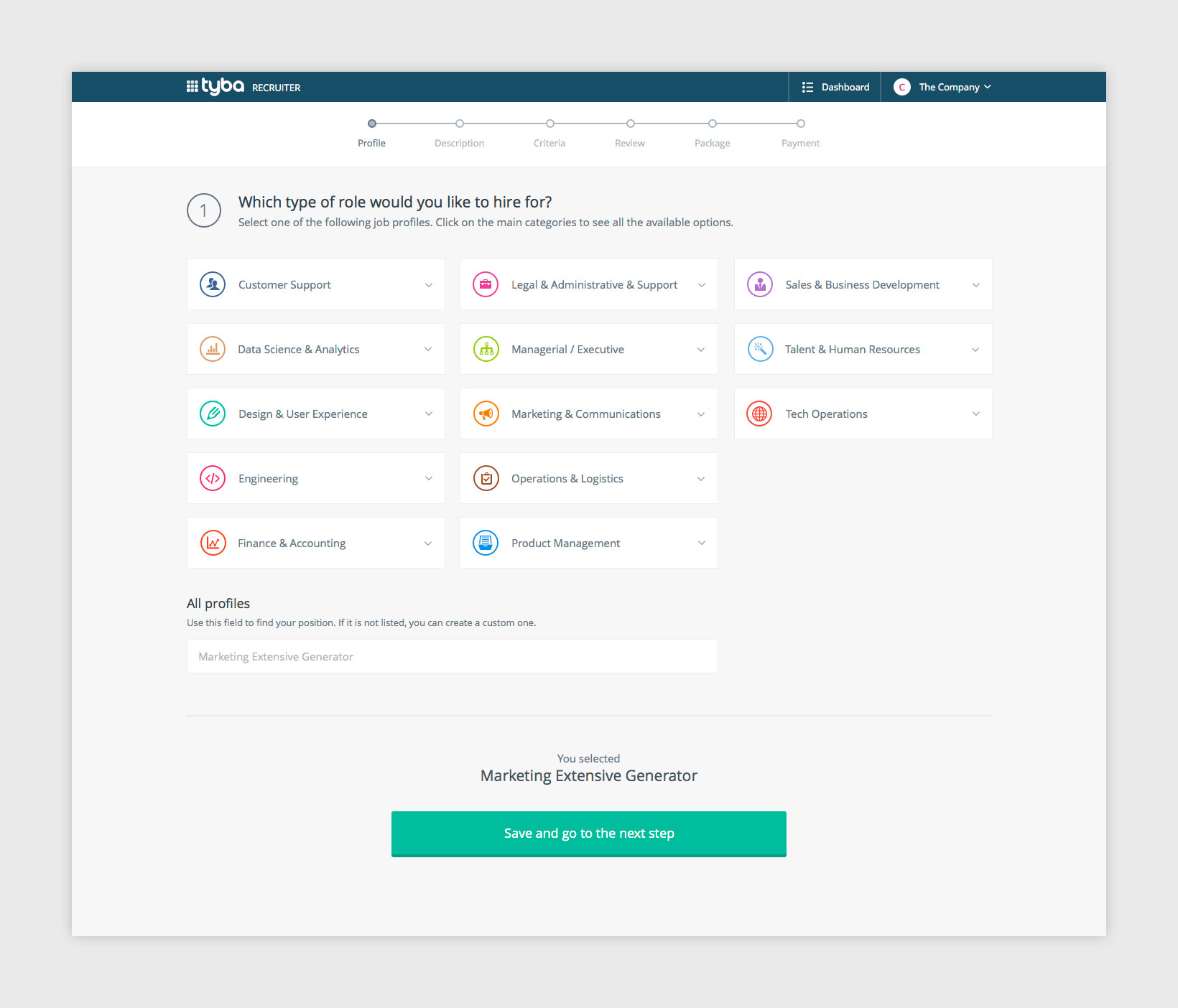
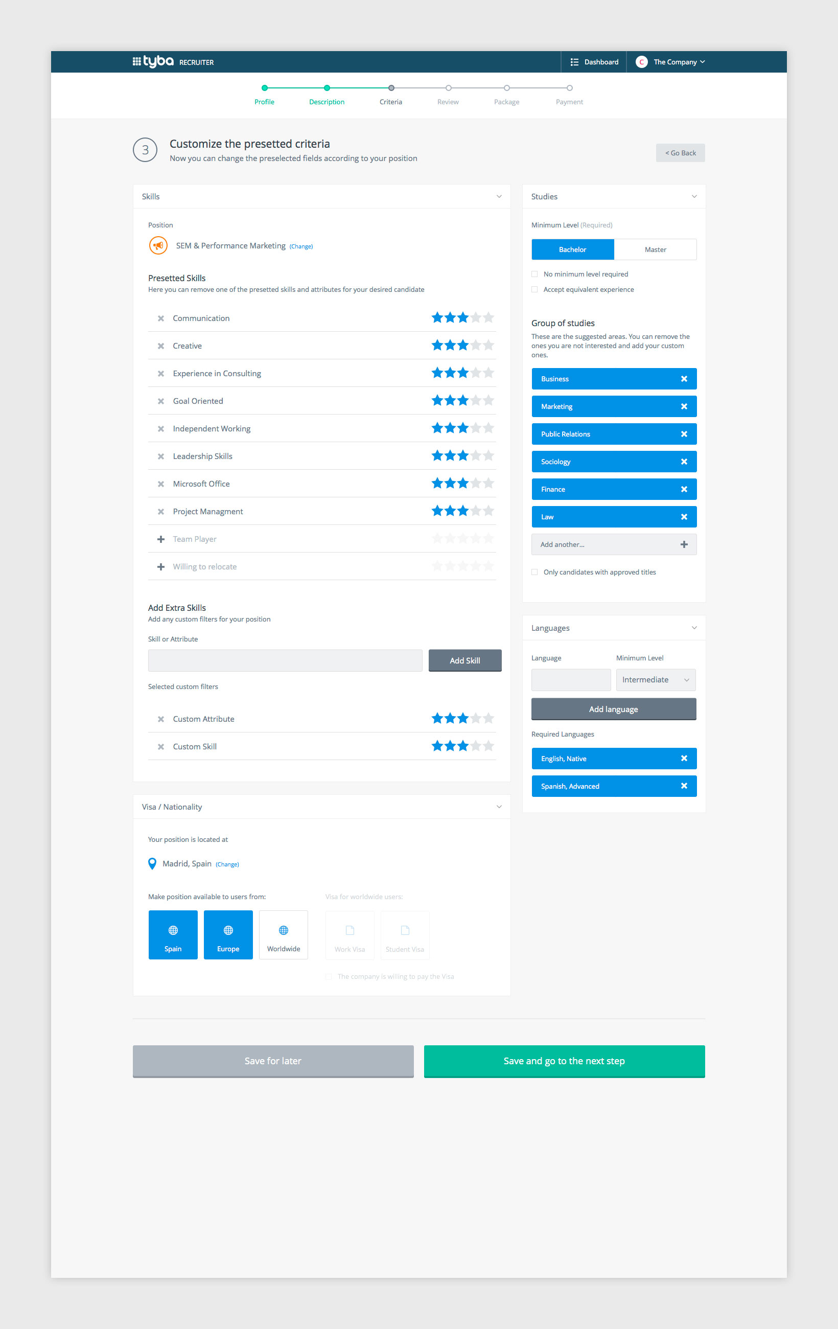
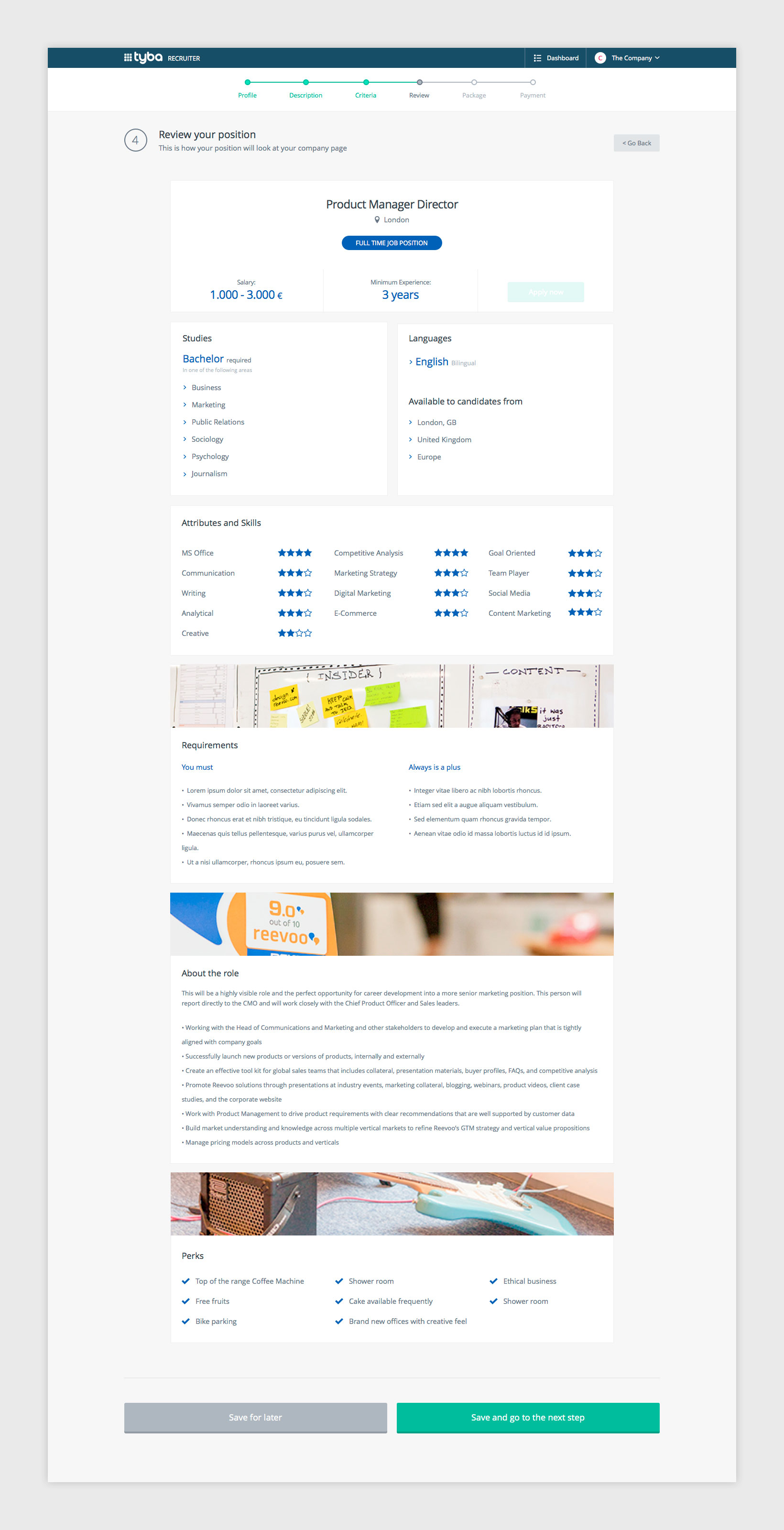
Position creator
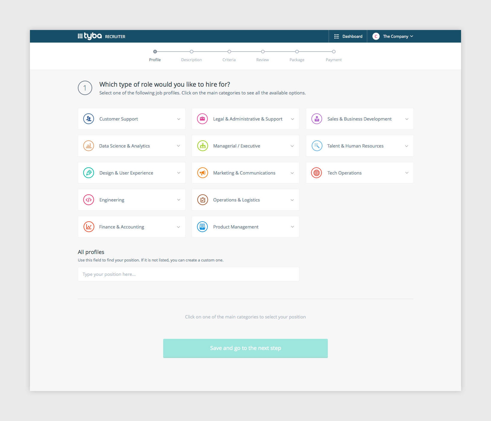
A step manager was designed to help recruiter to create job positions easily but also detailed, with a lot of posibilities but making it not too overwhelming using a clean and clear step sequence.


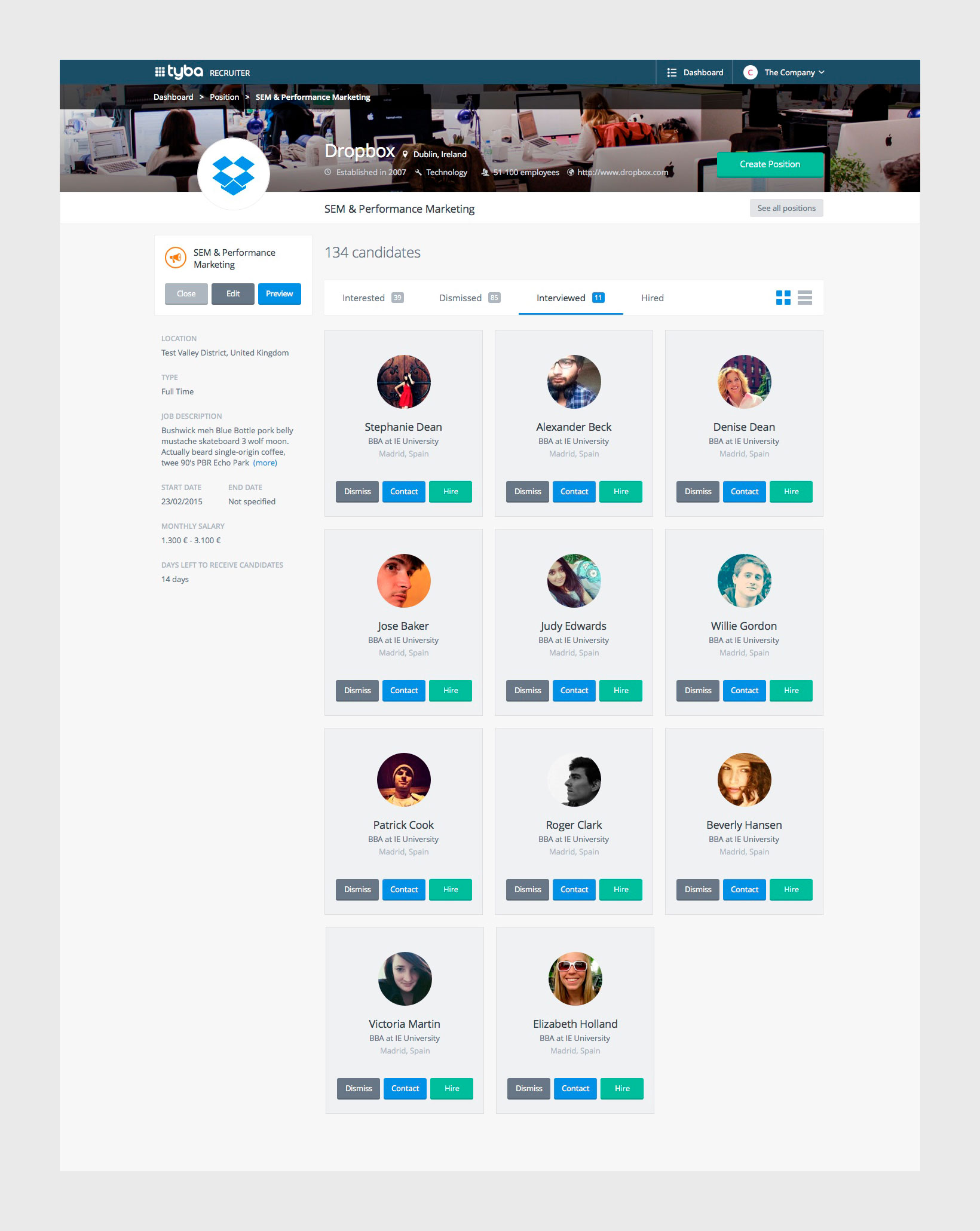
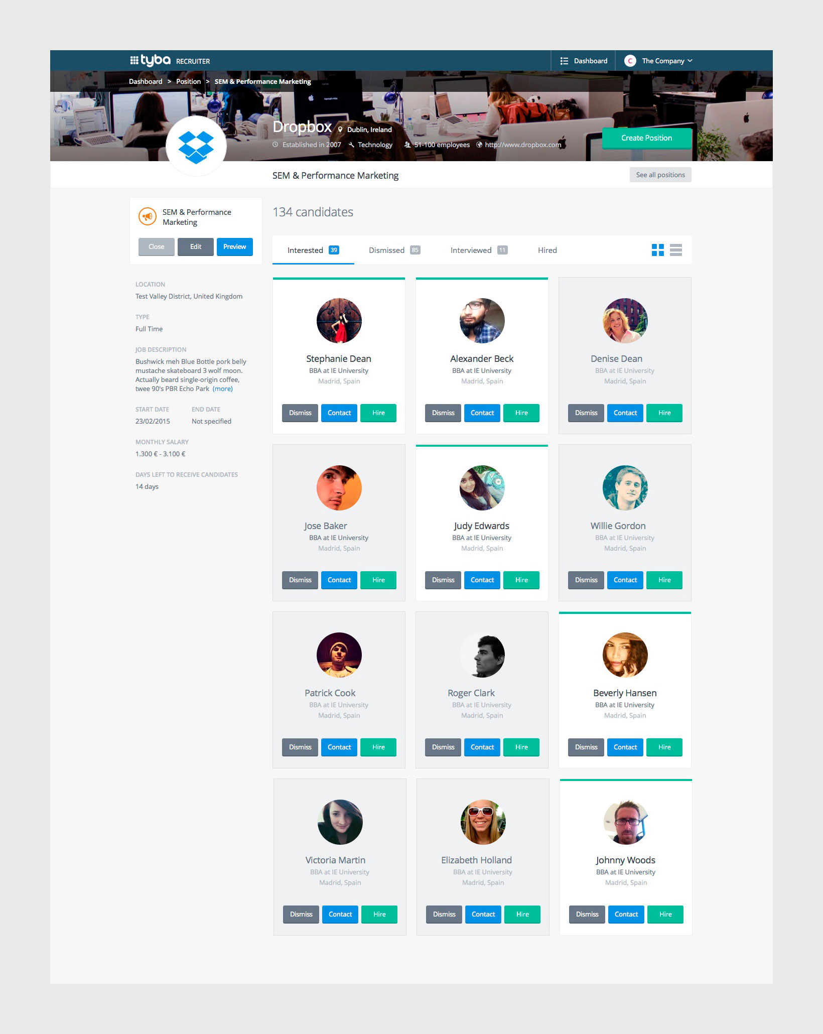
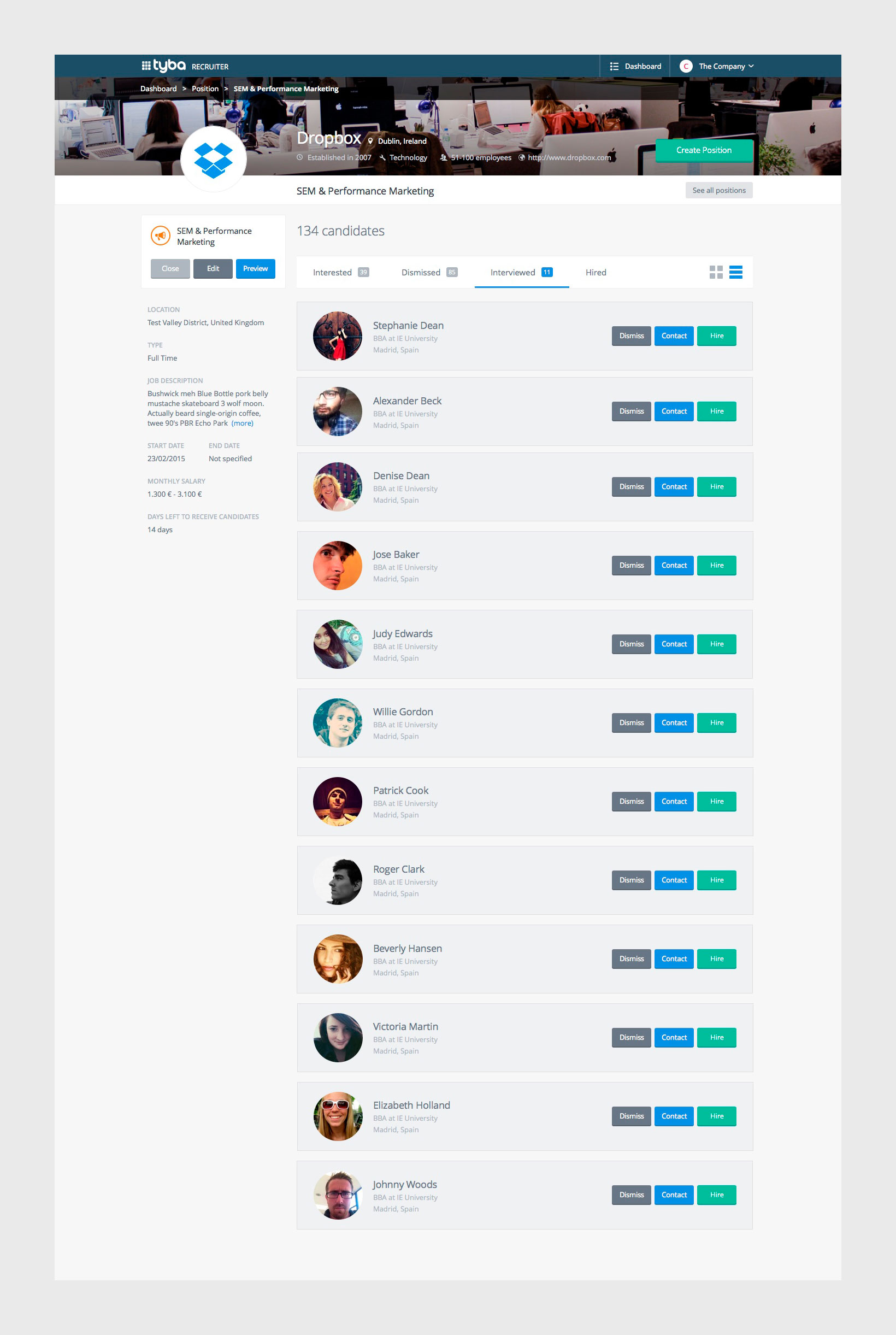
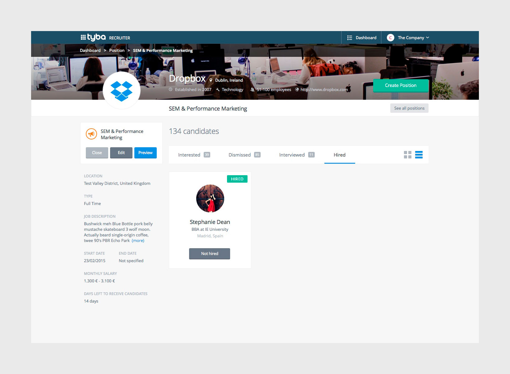
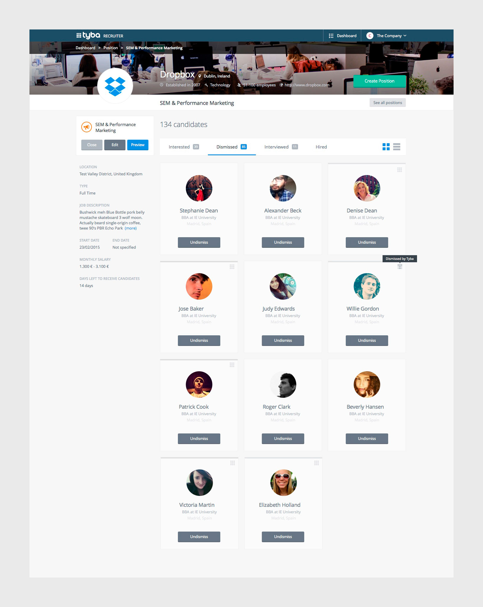
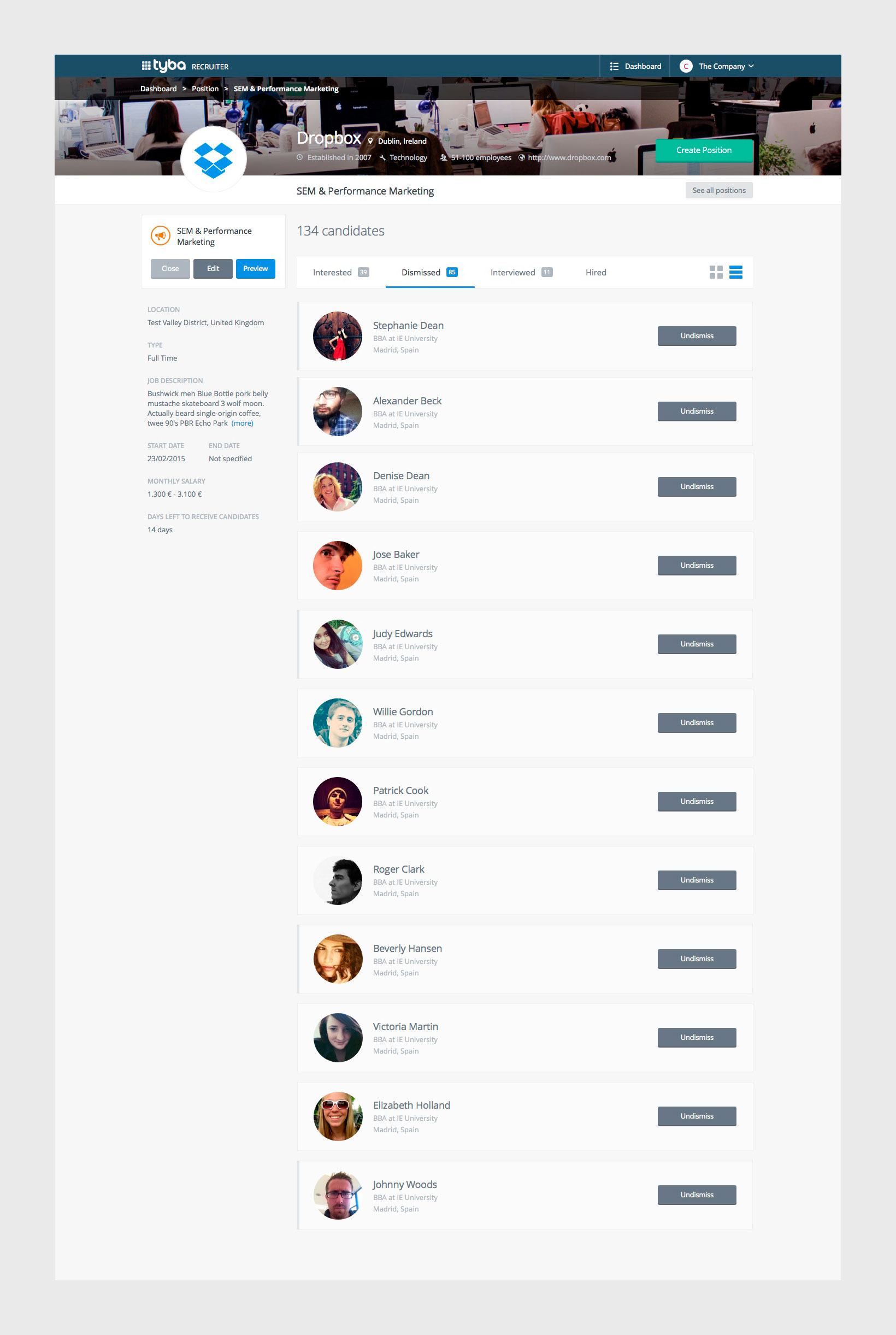
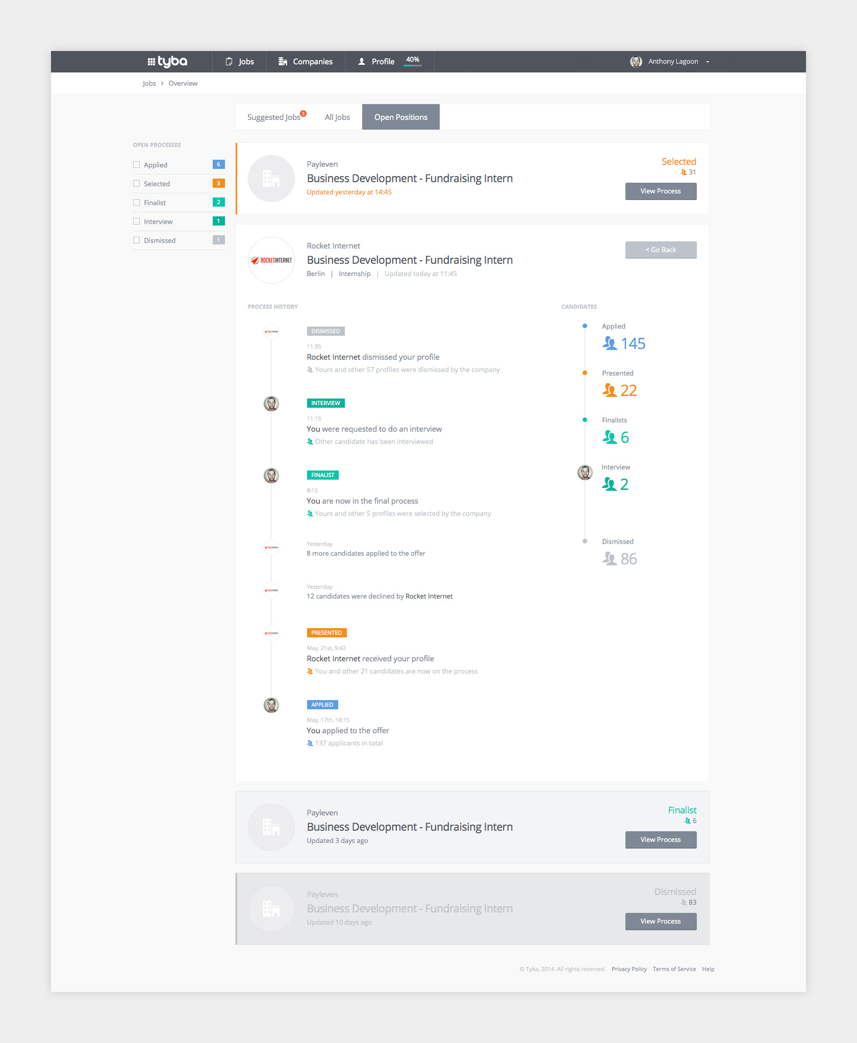
Recruiters Dashboard
To keep track of the positions and candidates, the registered companies had a full dashboard where follow all the details of the differente opened processes, interview candidates and review them.


Companies
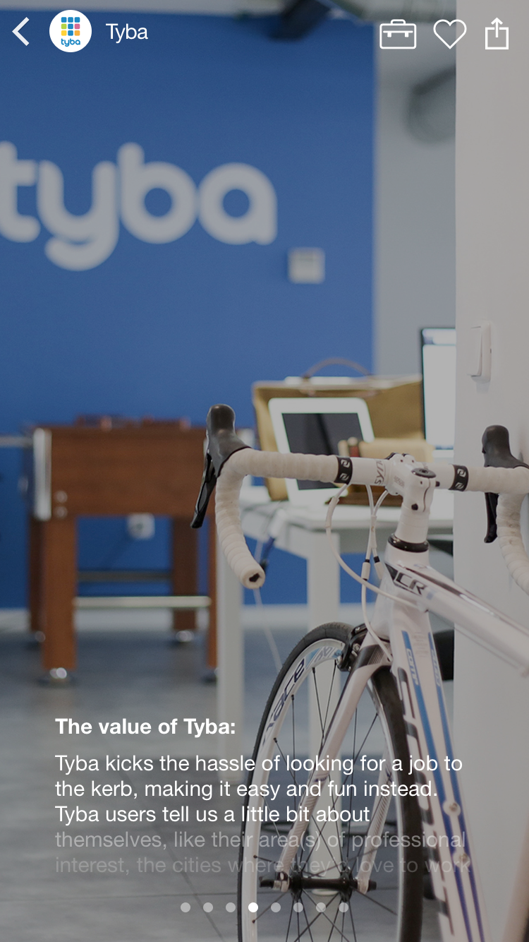
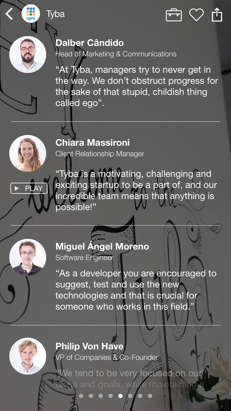
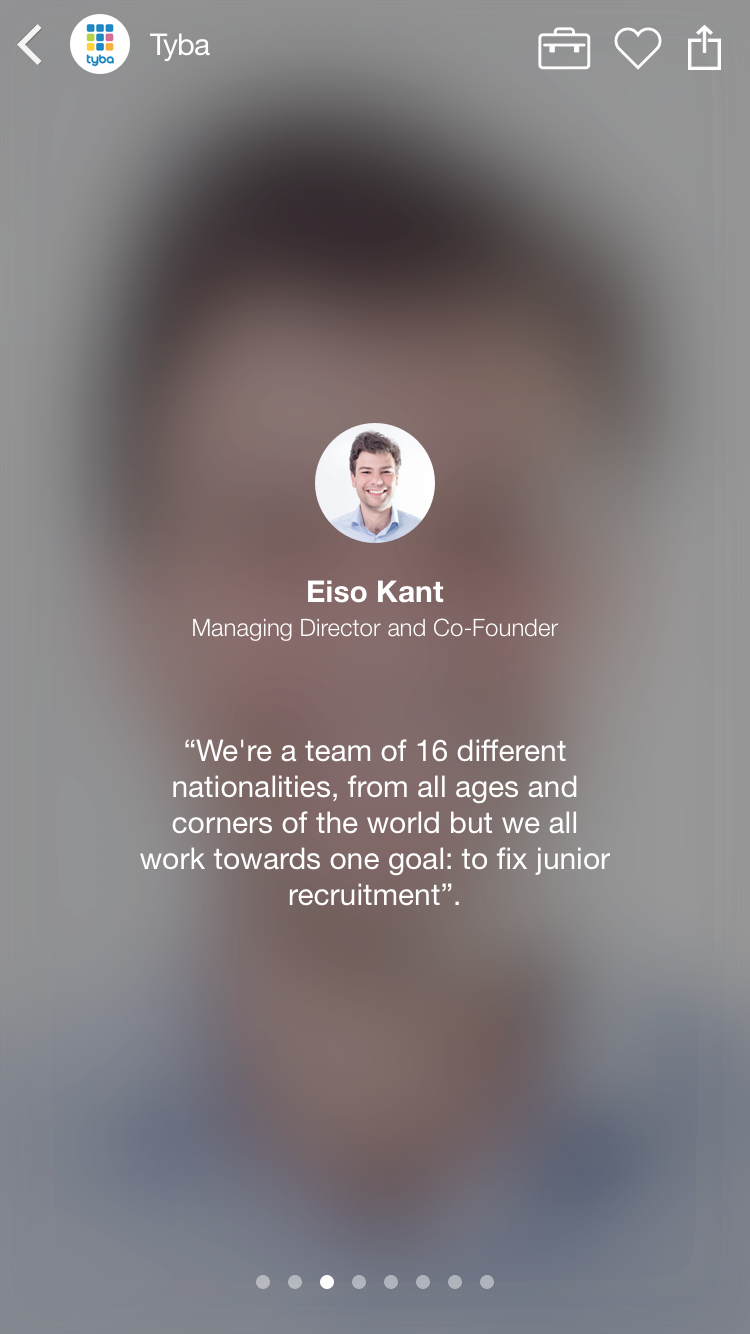
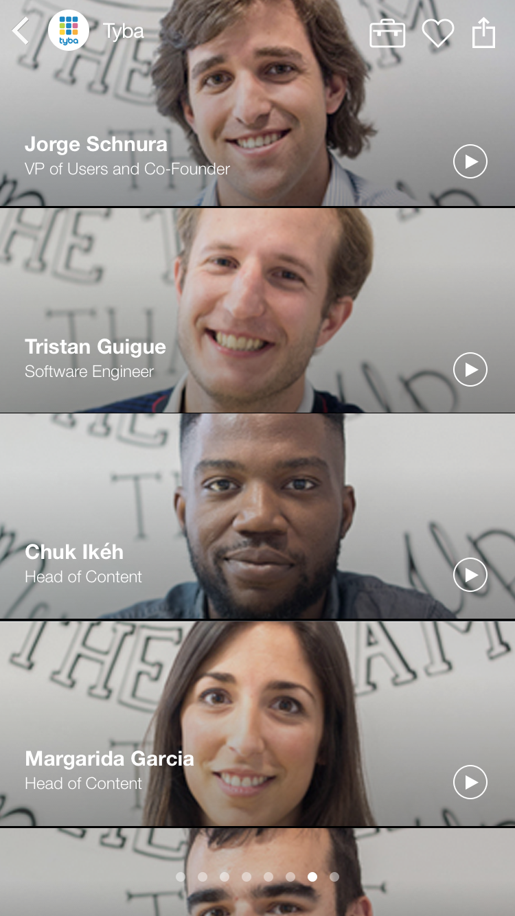
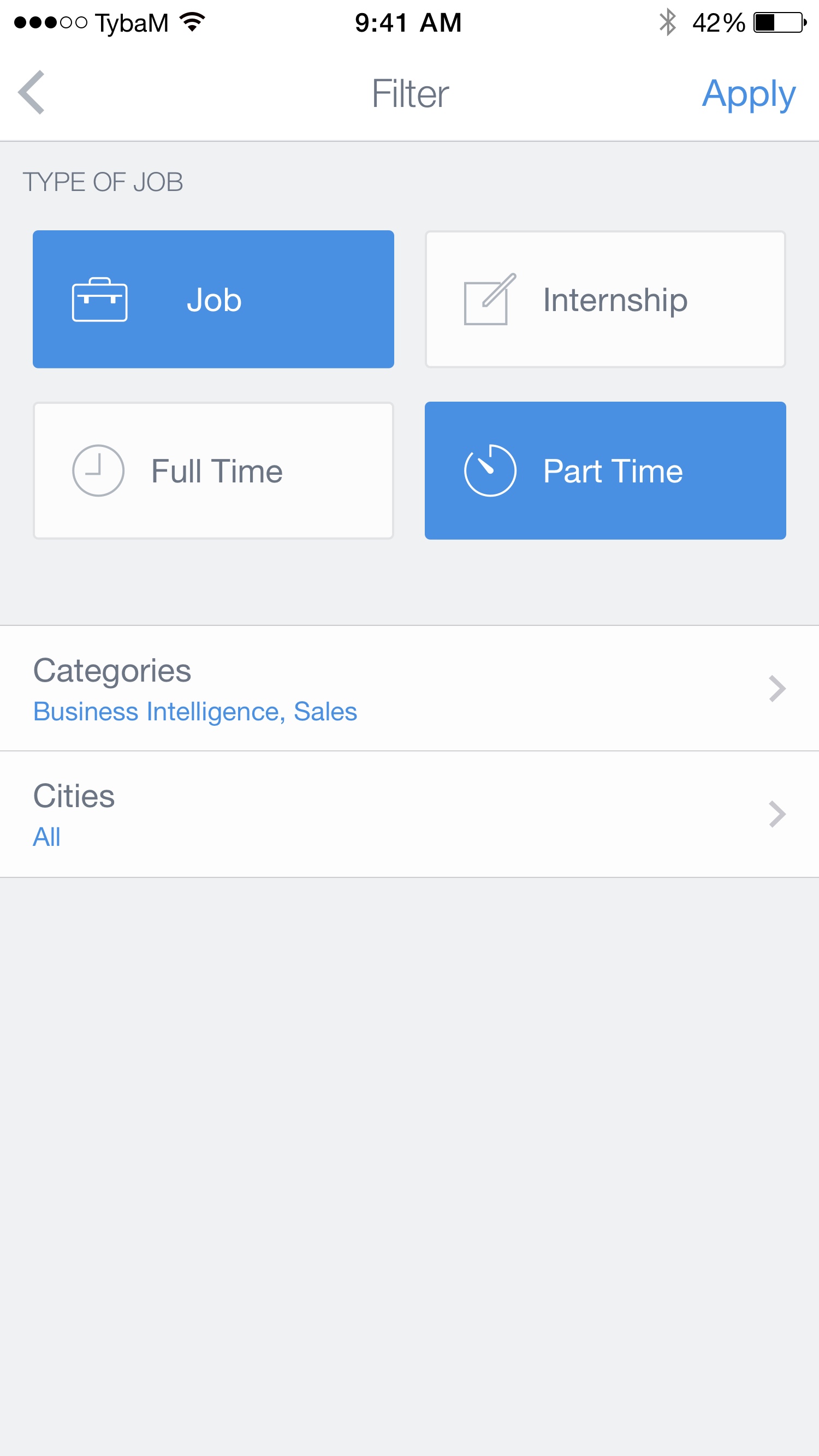
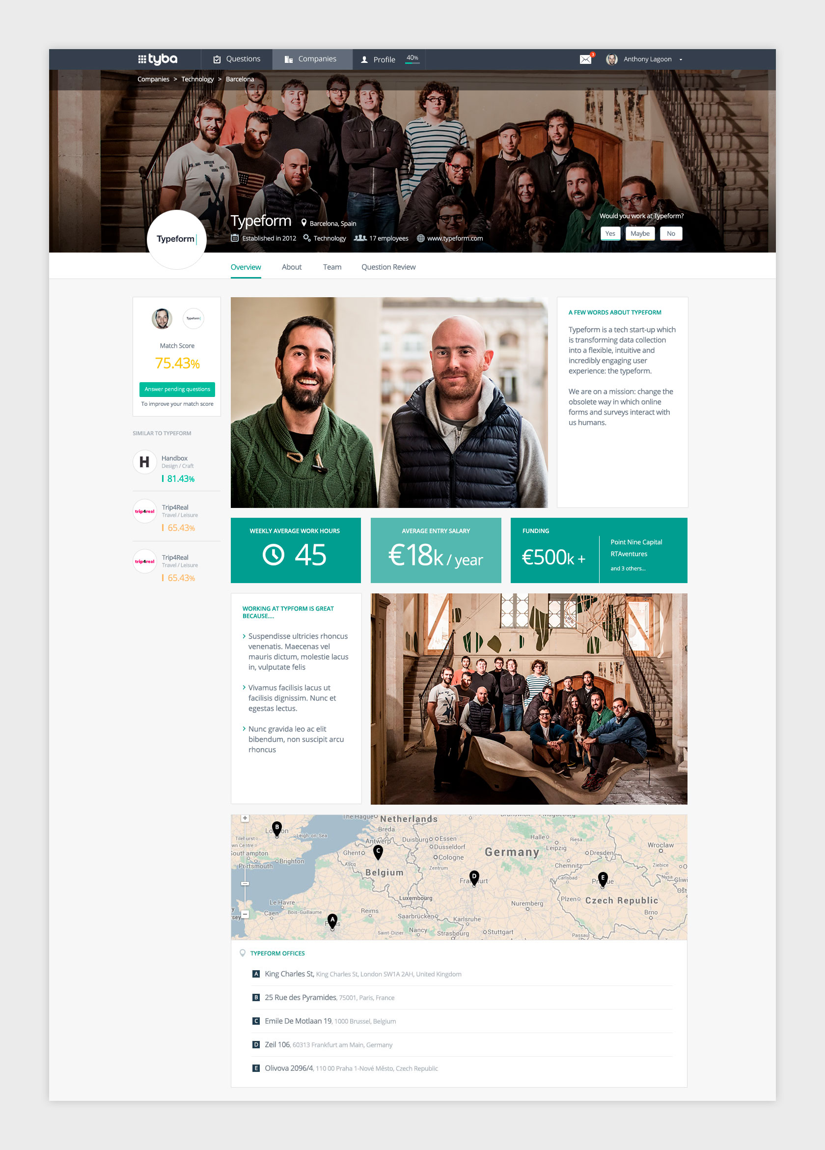
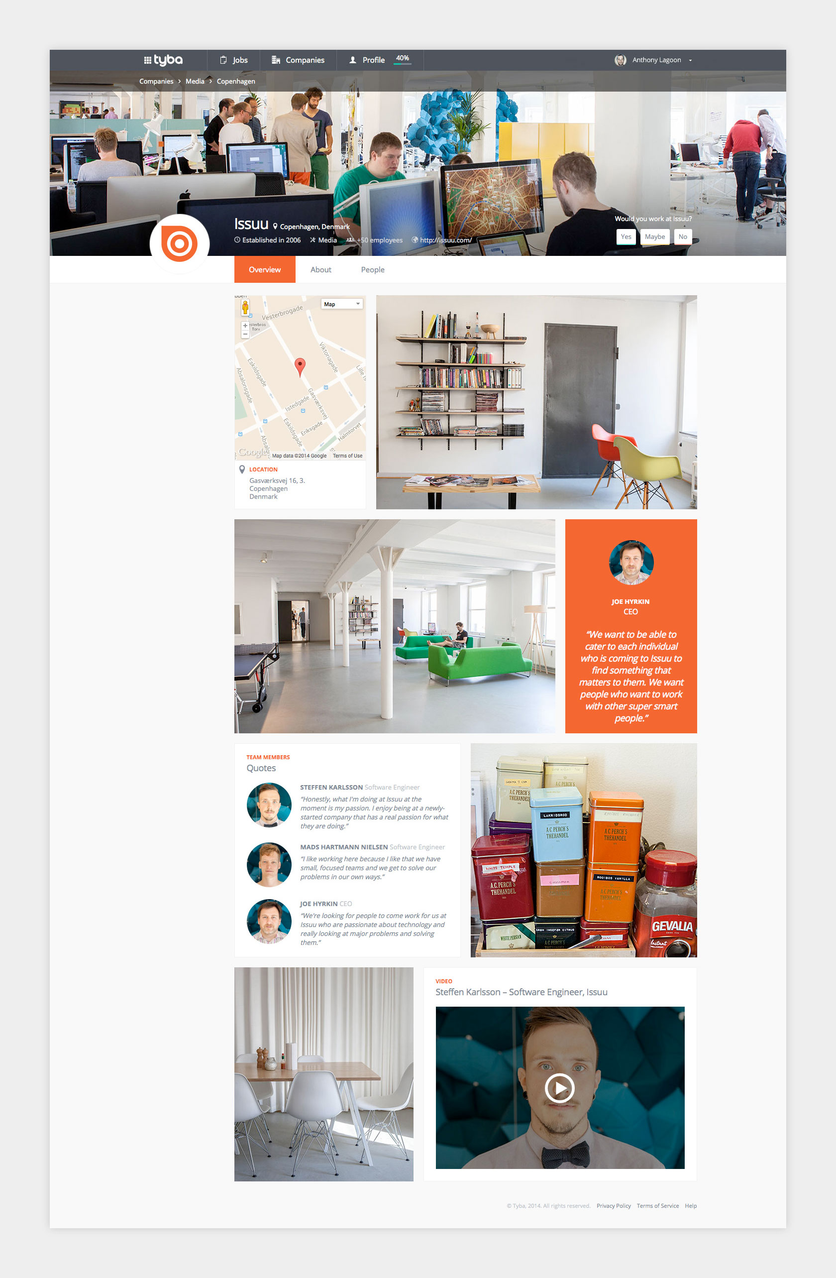
In order to show relevant information to the candidates, all the content from the companies was organized in company pages. Tyba visited companies with professional photographers from the team to create exclusive content about the work experience on some of the top startups in Europe. The users could filter this companies and jobs with simple filters according to their needs.


contact@zurinegrin.com
Do you like my work? Let's talk :)
Do you like my work? Let's talk :)
Do you like my work? Let's talk :)